This website is very simple and basic, this allows for its viewers to be able to use the website easily. Also when a link is clicked, the whole website does not change, only the centre does. This allows for the format to be basic and reduces time needed to create the website.
In this review I will be looking at the well known Danny Boyle directed film, 28 Days Later.
This clip shows titles that cross the screen and is a good way of showing time passing. Like in this clip, at the start of this trailer, these titles show by detailing an event on some of the days what is happening up to 28 days later.
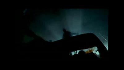
In this clip there are people running across cars and the way the camera is placed creates a great effect with the light and the silhouettes of the bodies as they run. Also, you can tell this is a clip from the non-equilibrium part of the film by the blood on the windscreen of the car.
This clip helps to show that the man is alone and the place is deserted. It does this by firstly not having anyone
else in the clip but also by having the phones hanging down, it shows that they have been used by someone who is not longer there.
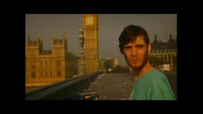
This clip shows Big Ben and London
bridge. This straight away points out that the location of this film, the setting, is in London. This clip also helps the audience relate to the story because the trailer uses well known places which would not usually be deserted.
Not like the other trailers we have reviewed, this film starts with fast paced scary clips and ends with slow and quiet clips. This creates a different effect and actually makes me believe this film will not be a thriller. Also this film trailer does not have many clips at all and they are mostly approximately only 2-5 seconds long. This shows that you can create an effective trailer with just a few short clips.
This trailer goes by the normal layout of zombie film trailers, starting with an equilibrium and finishing with a sequence of scary clips. In this trailer review I will take a look at the great zombie trailer of 28 Weeks Later. As this was a big budget film there will probably be many special effects and I will therefore not be able to use these ideas in my trailer. There
are also many real life scenes that use no special effects, so I will be looking
at these mostly.
In the equilibrium part of this trailer they are transporting British people back to Britain to repopulate the country. What I like about this clip is that the effect they convey is like they are being watched through a CCTV camera. This creates a great effect and if possible I will use it on in my trailer.
In this clip the camera is running forward like it is a hand-held camera. The lights are flashing red and the way the actor is running suggests to the audience that they are in some sort of trouble. This is a great way to show the viewer the transfer from equilibrium to when everything goes wrong.
I like this part of the trailer because it's when the music hits a climax and all of the fast paced scary clips start. This clip is filmed from the eyes of a zombie, which also creates a great effect and is not difficult to do.
This clip shows that the film is the sequel to 28 days later. It does this by staying true to the old film and keeping the same symbol and title used in the last film.
This is one of the earlier clips but I thought I would just show the level of special effects used to create a great visual effect. I don't have the skills needed to create such an effect and I do not think I will be going around blowing anything up any time soon, so I will have to do my best with the camera and acting.
This trailer has influenced me when thinking about my own trailer and, without even looking at the special effected clips, I still can get a lot of idea's what I can use in my own.
In this poster there is a lot of special effects used. This makes this poster better by making it a lot more interesting to look at but this can also be bad because an audience might think that the film is just special effects and no acting.
This poster does not have any real images but still creates a great horror effect. When creating my poster i will be sure not to flood it with real pictures.
In this clip it shows 'Jason Creed', one of the main characters in this film, doing a video diary and introducing
himself. As you can tell by his facial expressions, he is quite happy as nothing has gone wrong yet. You can also tell that the film is in the equilibrium state because he is clean and has no dirt on his clothes meaning he hasn't yet been attacked by the zombies. What I like about this clip is the transition from itself into the next by using a slightly fuzzy effect that looks like the camera was just being turned on. This helps to give the audience a sense of realism and also shows the style in which the film has been filmed (hand-held camera).
This image was the shortest clip that I noticed from the trailer. The thing about this is that everyone knows this is the error screen for when you have no signal or if your television has broken. This screen is the transition from when everything is all right to when everything goes wrong. Even though this clip doesn't even last for a second, it was very noticeable. I like this idea because it shows the distinct moment in the trailer when the dis-equilibrium occurs.
This clip is of real life footage of riots and looting. Even though a zombie invasion is unlikely in real life, the footage helps the audience to understand the havoc, mayhem and confusion that would occur if an invasion did happen. What I like mostly about the real life footage is that because it is so hectic it could well have been a zombie invasion, but the footage can be interpreted differently by different people.
Towards the end of the trailer the pace of the clips become a lot faster then they were at the beginning. A lot of the clips last no longer then 3 seconds each allowing the film producers to show the audience a lot of the film without giving anything away. Also there are many short and fast clips of zombies faces which frightens the audience but at the same time exciting them and make them want to see more of the film.
When I saw this trailer for the first time, I really enjoyed it. It made me feel like I wanted to see the film and, in fact, ended up doing so. By using the same sort of structure for my trailer, I am hoping I will be able to create the same effect on my audience.
Through analysing a film poster i have seen that the DVD case front cover and the poster are very similar. The main difference is that the poster has a lot more information on it, i believe this is because its only one page and the viewer is not going to be looking at a poster for as long as a DVD case.
Even though in my brief i am not required to create a DVD case cover, I thought I would still analyse a couple to help understand a way a film would be marketed and the similarity between a DVD case cover and a poster.
Taking into consideration that we need a USP for our film trailer seeing there are a lot of films in this market. Our idea in depth is that its going to be more about survival rather then just running away. My dad is the site manager for a primary school so i am waiting for a reply from the headmaster to allow us to use his school for filming, i believe this will give our trailer the reality feeling that other zombies lack and what we have always wanted to accomplish.
Mine and charlies idea for our Promotional package for a new film is to do a thriller/horror film. Our main idea for this thriller/horror film is an infection or a zombie type film.
We decided this because we wanted to do something that an audience of our age would enjoy and something that would not need any special effects or a complicated set. We want to try and use a well known place for a couple of our shots because i have found i enjoy scary films a lot more when i can believe it could possibly happen. For example in the film '28 days later' there's a shot of someone walking over the deserted westminster bridge, this is the sort of thing i want to try to get.
 This website is very simple and basic, this allows for its viewers to be able to use the website easily. Also when a link is clicked, the whole website does not change, only the centre does. This allows for the format to be basic and reduces time needed to create the website.